

PROJECT OVERVIEW
SCOPE OF WORK:
Logo Design, Branding
VIBE:
Approachable, Feminine, Empowering
INDUSTRY:
Wellness
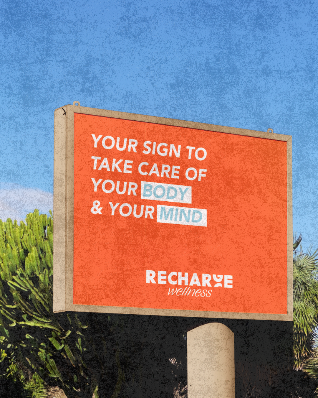
Recharge Wellness is focused on movement, connection, and self-care. Through dance-based fitness, they help people feel confident and comfortable in their bodies while fostering a sense of community. Their retreats provide women with the opportunity to unplug, recharge, and build meaningful connections as they invest in their well-being. The branding goals were to feel like a fun, welcoming space to become friends right away!

DESIGN DETAILS:
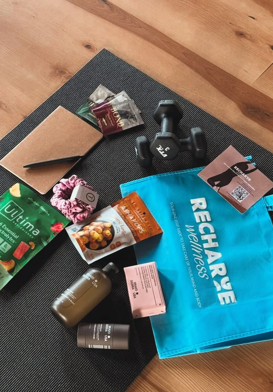
The client was torn between bold, eye-catching branding and the minimalist "clean girl" aesthetic. To blend these styles, I created a sleek wordmark with a subtle touch of personality. The ‘G’ in the logo is designed to symbolize recharging, reinforcing the brand’s focus on renewal and energy. A vibrant palette of orange and blue hues adds a fun, dynamic element to the overall clean and modern design.

Thank you for everything you did, the end result is just perfect. It’s exactly what I was looking for, and I’m so grateful for the way you worked with me. You are so talented, and I am so happy and excited about these!
-Rachel, Recharge Wellness